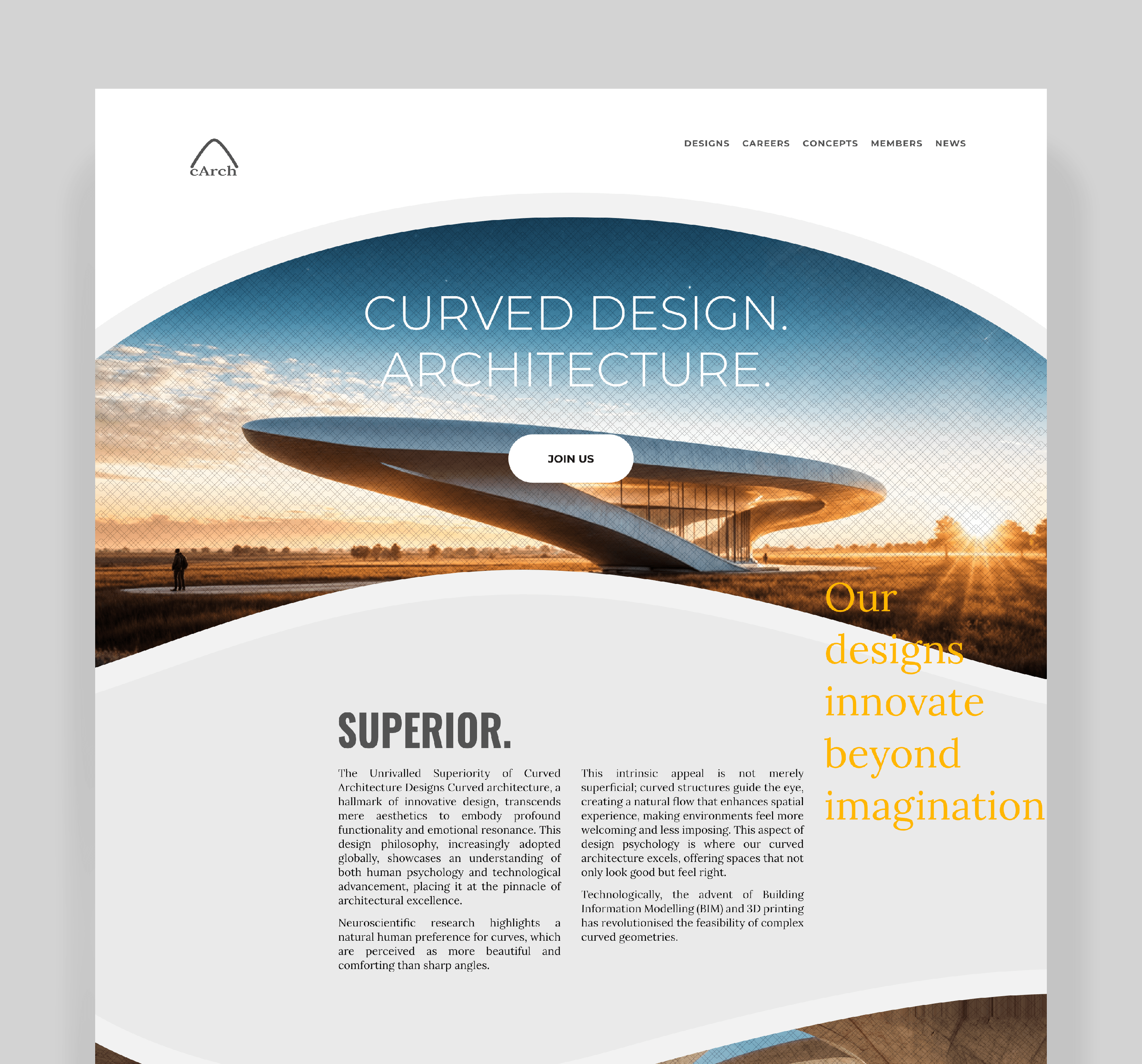
For this architecture project, I recommend a brochure-style design to highlight the company’s elegance and superior architectural prowess.
I incorporated a curved design concept throughout, reflecting the brand identity of their curvilinear architectural structures.

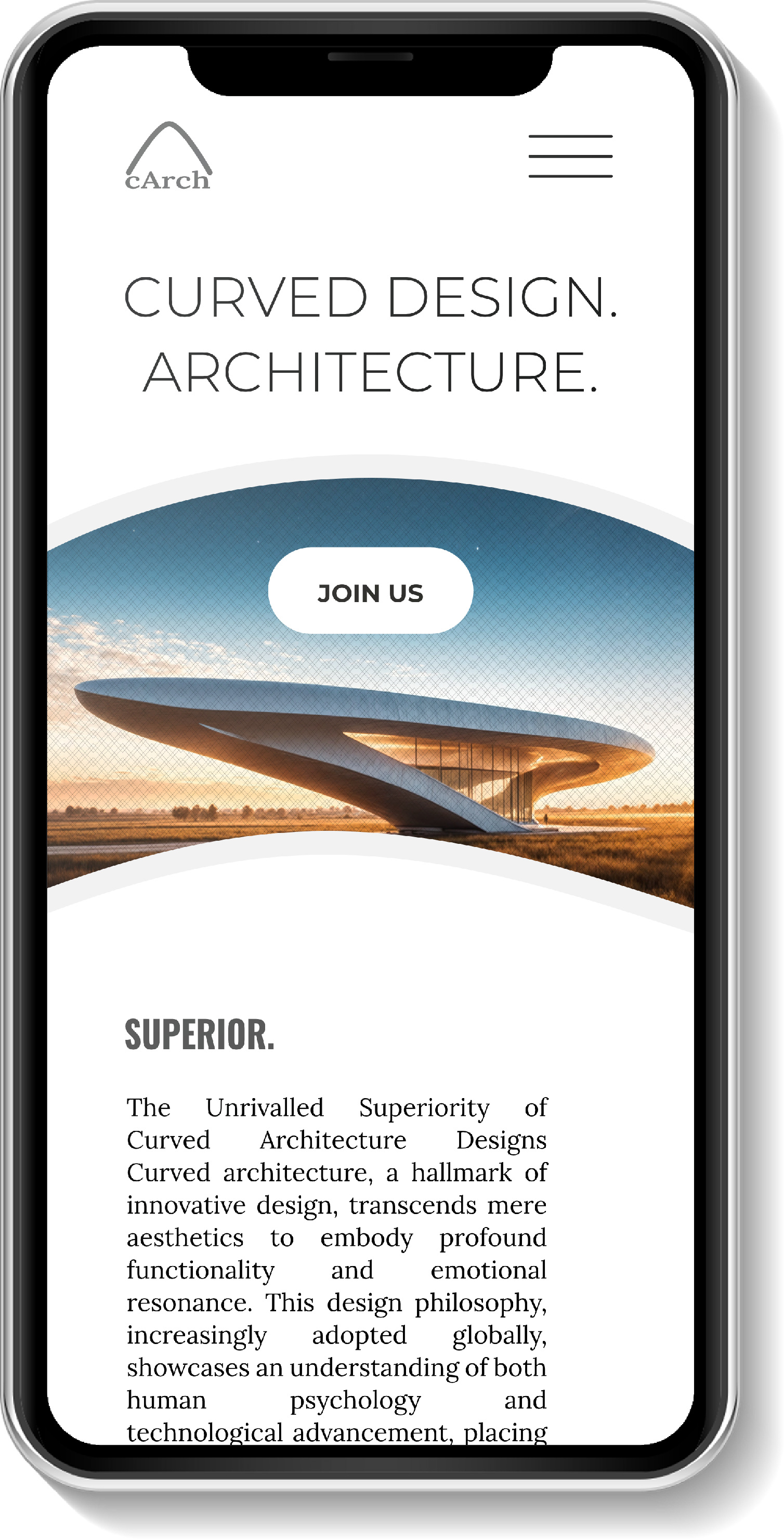
The mobile version maintains the curvature aesthetic for a clean, elegant user experience.
